NUMO Cannabis Co. Brand Identity
Scope
Brand Identity
Print Design
Website Design
Brand Guidelines
Client
NUMO Cannabis Co.
Branding, website design, and brand guidelines for a new startup Canadian cannabis retailer — NUMO Cannabis Co.
A local cannabis company approached me to help them bring the concept of their dream brand to life. Their brand message was about approaching recreational cannabis with an emphasis on the experience that each strain of cannabis offers to the end user. I created a full brand identity system — including logo design, brand identity guidelines, and print collateral — as well as website design for them that helped to setup a solid foundation for their initial brand launch and store opening.
The Visual Identity System

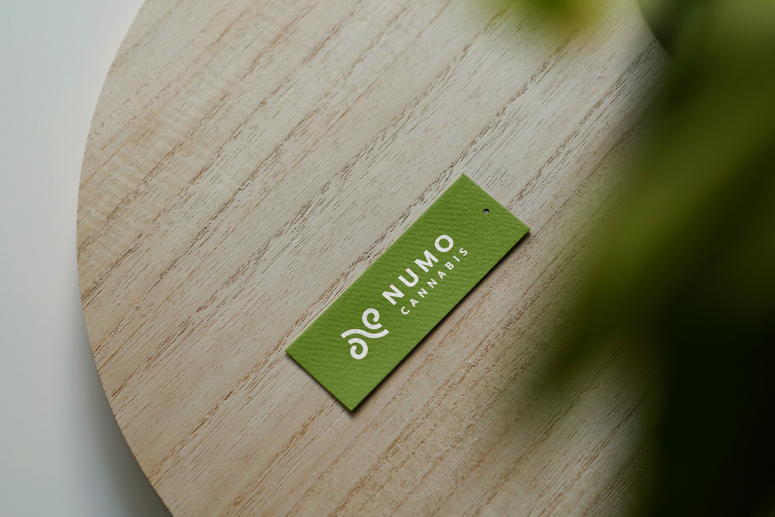
The Brandmark
NUMO’s brand values centred around being transparent, customer oriented, and providing a unique experience to the end user. I used the ongoing theme of air and cannabis to bring fluidness to the final logo design. The brandmark is structured yet organic; the curved lines paired with negative space guide the eye through the logo and create a memorable impression of the letter N.
-
Primary Logo – Stacked

-
Brandmark

-
Primary Logo – Horizontal

Brand Colour Palette

It was important to closely reference the teams plans for the interior colours of the store while I was developing the colour palette. I further incorporated the feeling of air into the brand by including cool and warm tone greys, using the colour green as an earthy contrast.
Both chosen primary and secondary typefaces are sans-serif to communicate a soft, clean, and modern look.
Typography
Primary Typeface – Scala Sans OT

Secondary Typeface – Barlow