Stormboard Design System
Scope:
—Lead Product Designer
Client:
Stormboard
Timeline:
January 2021–August 2024
Building a new design system from scratch for a visual collaboration platform that is guided by clear standards to reuse functional elements, components, and patterns to allow our product team to manage design at scale by reducing redundancy while creating a shared language and visual consistency across different pages and channels.
My Role
I functioned as the lead product designer on this project, leading the visual design, system design, UX/UI design and a portion of the user research of this project from end to end. Our small team collaborated closely together throughout the entire project, this included the CEO, CTO, Product Manager, and Developers.
Understanding the problem
With no design system and an outdated style guide that wasn’t used often, we were creating inconsistent components within our product and wasting time reinventing patterns.
Stormboard is all-in-one collaboration, communication, and project management platform that makes it easier for remote, in-person, and hybrid teams to work better together.
At the time I was brought onto the Stormboard team, the main challenge was that the platform lacked a consistent design system that is backed by clear standards. The absence of an organization-wide design system led to inconsistent visual appearance and experiences that seem fragmented or unrelated to the brand.
Defining project goals
Build a consistent design system that is guided by clear standards to manage design at scale.
Reducing redundancy while creating a shared language and visual consistency across different pages and channels.
Create a thorough brand guidelines document to help achieve brand consistency.
Explicitly written usage guidelines and style guides help onboard individual contributors who are new to UI design or content creation and also serve as a reminder for the rest of the contributors.
My design process
Creating a design system is a process that requires a careful approach.
01
Research and Define Scope
02
Identify Component Purposes
03
Create Style Guide and Component Library
04
Create Documentation
Competitive analysis
The focus of this competitive analysis was to review design styles, copy, flows, service offerings, and feelings evoked by the design solutions of our competitors.
Doing so allowed me to see what types of styles were already being used and identity if there were any gaps in the market.
Competitor visuals were tailored towards design and product teams, lacking appeal to the data-centric teams and executives that our platform is primarily targeting. These findings allowed me to tailor the tone of voice and visual design standards to fits the wants and needs of our user personas.
Defining brand identity guidelines
Understanding the brand is key to creating a successful outcome (and defining what success means in the first place).
Stormboard only had a logo suite and a very minimal brand style guide when I was initially brought on to the team, so it was essential do develop a thorough brand guidelines document that could be closely referenced across all departments going forward.
These guidelines I created help to make sure that every customer interaction with our brand is as powerful and effective as it can be, while also serving to provide relevant guidance in context.
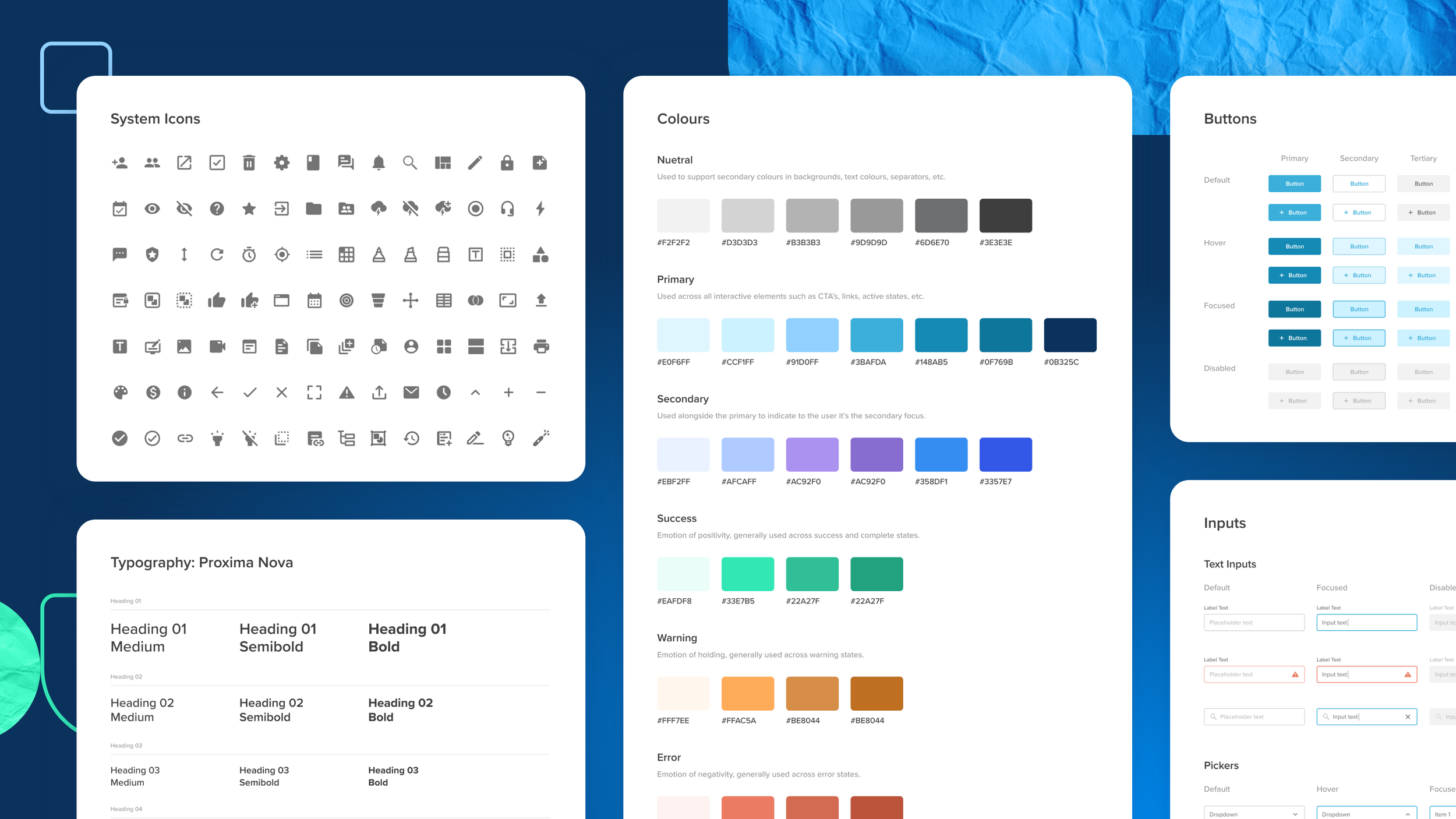
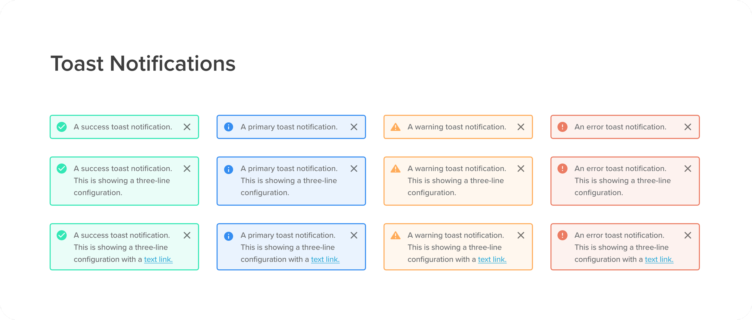
The new design system & component library
The images below show key foundational elements of the design system — base elements, components, type hierarchy, form fields, iconography and button behaviours. We designed to cover all scenarios, or “states” in the system: hover, focus, filled out, error, and disabled state. Each component we designed with accessibility in mind.


