
Typography 101: Type Properties
Welcome to my newest blog series – Typography 101! Since I started my design career I’ve always been very interested in typography and lettering, so I thought that a series dissecting all you need to know about typography would be helpful to those up and coming letterers out there (myself included).
Today’s blog will be covering type properties. You’ll learn about the different names of letterform parts and what makes a typeface a typeface.
Baseline
The baseline is a invisible horizontal line that a line of text rests on. In most typefaces, the descenders on letters such as y or g extend below the baseline while letters such as such as o or c just slightly extend below the baseline. Below you can see that all of the letters rest on the baseline, but both y and b extend below the baseline (the letter b only slightly).

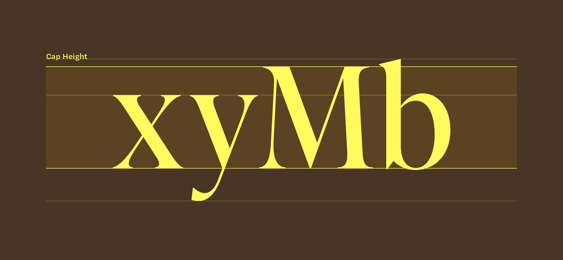
Cap height
The cap height of a typeface refers to the height of it’s flat capital letters, such as M or I and is measured from the baseline. Not all letters meet this height, round and pointed capital letters such as O or A are optically adjusted to overshoot the cap height so that they appear to the eye as being the same size. You’ll notice that different typefaces have unique cap heights that are specifically designed to fit their style.
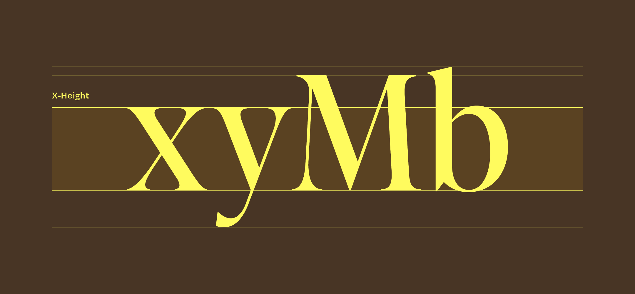
X-height
A typeface’s x-height refers to the height of the lowercase x. This height is significant when designing or choosing a typeface because it indicates how tall or short each glyph will be.
When I am choosing a typeface for a client, website, or design piece, I always look at the x-height to determine how legible it will be at smaller type sizes – tall x-heights have more white space within each letter so they are typically easier to read.
Ascenders & descenders
Ascenders refer to the upward vertical stroke that extend beyond the cap height, as seen in the letter b in the example below. These are found in certain lowercase letters and can vary by typeface.
Descenders are the downward vertical stroke that extend below the baseline, as seen in the letter y below.

Serif
A serif refers to a small shape that is added to a letter at the beginning or end of it’s stroke. Serif fonts are opposite to sans serif fonts – hence the name – as seen in the example below. Serif fonts are grouped into one of five classifications:
Old-Style serifs
Transitional serifs
Didone or neoclassical serifs
Slab serifs
I’ll be diving into all five of these classifications in a future blog so stay tuned!

Stem
Stems are vertical or diagonal strokes, and form the core of most letters within a font – as seen in the example below.

Counter or “bowl”
The counter refers to the area within a letter that is either entirely or partially enclosed by the letter form itself or a symbol – as seen in the example below. The stroke of the letter that creates this space is known as a “bowl”.

I hope that this first instalment of my Typography 101 series either refreshed your memory on type properties, or taught you something new!
As always, leave a comment below if you have any questions – I’ll join you all in the next instalment!


